Insights & Inspiration from Design Hive
Dive into our latest articles, expert analyses, and creative insights covering the dynamic world of web design, digital marketing, and cutting-edge technology. Stay ahead with designhive's thought leadership.
Explore Our Latest Articles
Mastering Responsive Design with Bootstrap 5
Published on: October 26, 2023 By: Jane Doe

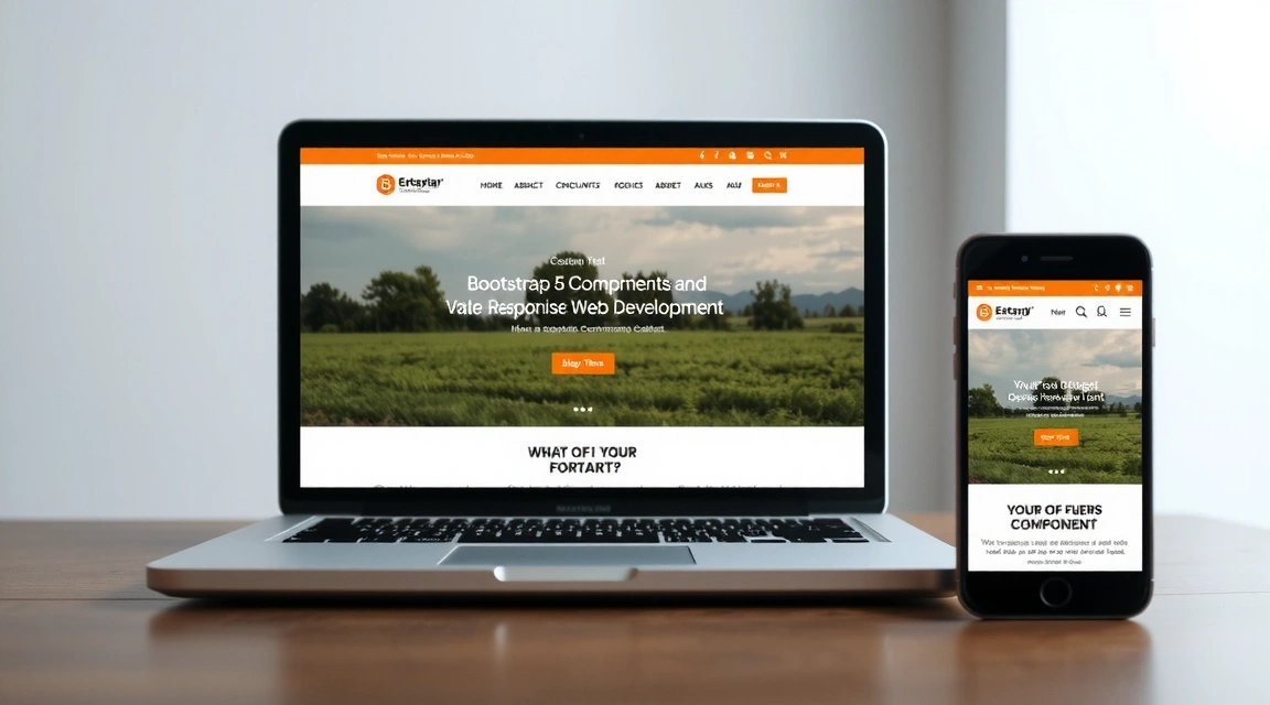
In today's multi-device world, responsive web design is no longer an option—it's a necessity. Users access websites from a myriad of devices, from vast desktop monitors to compact smartwatches. If your website doesn't adapt gracefully to each screen size, you risk alienating a significant portion of your audience.
The Power of Bootstrap 5 Grid System
Bootstrap 5 builds on its predecessors with an even more robust and flexible grid system, powered by Flexbox. This allows developers to create complex, responsive layouts with minimal effort. Understanding its breakpoints and utility classes is key to mastering responsive design.
- Mobile-first approach: Bootstrap 5 encourages designing for the smallest screen first, then scaling up.
- Six default breakpoints: `xs`, `sm`, `md`, `lg`, `xl`, `xxl` provide granular control over layout.
- Gutters and column classes: Easily manage spacing and content distribution across rows.
- Flexbox utilities: Align, justify, and order content with simple classes like `d-flex`, `justify-content-center`, `align-items-start`.

Essential Responsive Components and Utilities
Beyond the grid, Bootstrap offers a wealth of components and utility classes designed to make your website responsive and user-friendly on every device.
Responsive Images
Use .img-fluid to ensure images scale perfectly to their parent container, preventing overflow and maintaining aspect ratios.
Responsive Tables
Wrap tables in .table-responsive to add horizontal scrolling on small devices, keeping content accessible without breaking layouts.
Display Utilities
Control element visibility with classes like .d-none, .d-sm-block, .d-md-none to show or hide content based on screen size.
Text Alignment & Sizing
Adjust text alignment and font sizes responsively using .text-center, .text-md-start, and responsive font sizes.
Testing and Debugging Responsive Layouts
Building a responsive website isn't just about applying classes; it's also about rigorous testing. Utilize browser developer tools to simulate different device sizes and orientations. Pay attention to:
- Content readability and legibility on small screens.
- Touch target sizes for buttons and links.
- Horizontal scrolling issues.
- Image and video scaling.
"Responsive design is not just about making things smaller; it's about making them more accessible and enjoyable for every user, on every device."
By diligently applying Bootstrap 5's responsive features and thoroughly testing your designs, you can create websites that offer an exceptional user experience, regardless of how or where they are accessed. Embrace the mobile-first philosophy, and your audience will thank you.
Never Miss an Update!
Subscribe to our newsletter for exclusive insights, design tips, and the latest industry news delivered straight to your inbox.
We respect your privacy and will not share your email.